The form factor of Play Store apps must adapt to different types of devices. The applications can also be run on various television sets, different sizes of handsets and Chrome devices. You must consider the methods of interaction, too, as the television sets will not have a touchscreen.
The developers must also consider the font and text size of the app content. You must believe that there could be some requirements for the application being run on televisions or other large screens. There can be a difference in the layouts for various window sizes. The resource qualifiers can ensure this can happen. The difference can be because of the constraints on the device screen.
Designing responsive content

It is essential to provide an enriching experience for all app users. You must leverage the full screen size of the window and create a responsive app. The app will take the entire window screen but should not hide details as the screen size wasn’t matching. The app must be optimised to the fullest so that it can readily use the full device screen width.
It is necessary that you adequately attend to the user expectations. The content and the screen set-up must be such that it is fully optimised for small and large screens. There must not be too much white space on larger screens which can look awkward and affect customer interaction levels. It can also lead to awkward interactions between the Play Store app and the customer.
The developer must decide the various resources that will be provided for different window sizes. There are specific steps that the developer must follow to implement their ideas.
Providing tailored user experiences

The developer must remember that the app must provide brilliant experiences that will allow the user to interact better with the app. The user must be presented with the ideal experience better than the competition. The experiences must be better than the competition and be beyond just filling in the white spaces. The user interface must be personalised using Android Studio, which provides the optimal user experience and enhance the app usage parameters.
Developers must remember that the user experience must be consistent for all window sizes and use various widgets and layouts. You can use BottomNavigationView during Android development as the top-level navigation when there is proper vertical space. Remember that when the window size is lesser, you can implement the top-level navigation using a DrawerLayout.
The toolbar can hide or show action menu items for the space available. The RecyclerView.LayoutManager can change the span count and leverage the window size. Developers can increase the amount of detail shown for custom views as there is more space.
Responsive layout – ConstraintLayout

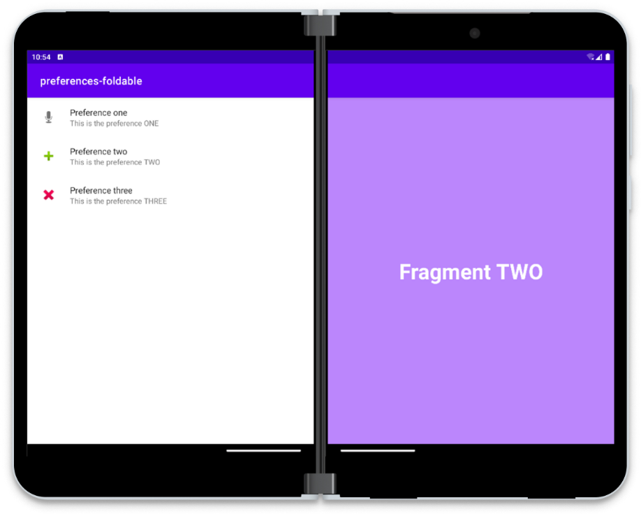
Developers must adapt to several device configurations, and the app layout must respond to various screen orientations and sizes, which will ensure a better user experience. The advent of foldables can also change the posture and impact the Play Store app. As the posture changes, the display panes’ aspect ratio can also change.
You can use ConstraintLayout to create a responsive layout during Android development for various screen sizes. You can specify the size and position for each view basis the spatial relationships with other layout views. The views can stretch and move together as the screen size changes. ConstraintLayout is about creating constraints and defining the relationship between two widgets in the controls and layout and how you can position the widgets within the layout.
ConstaintLayout is a popular Jetpack library shipped separately from the Android OS. In ConstraintLayout 2.1, various features were introduced to manage foldable devices better. It included features like SharedValues, ReactiveGuide, and better animation support. You can handle adding a dependency by adding the Google Maven repository to your project
Jetpack WindowManager for larger screen
Jetpack WindowManager is a new addition in Android Studio that allows developers to handle large screens and foldables comprehensively. It is like Android WindowManager, but it also adds support for foldables. The Jetpack WindowManager library can help developers provide support for various form factors. All foldable devices will have multiple features and configurations like hinges, folds, and curved areas. The placement and layout of the content in the window must avoid disruptive areas.
The key features of Jetpack WindowManager are:
- WindowLayoutInfo has a list of display features within the window. You can alter the positions, features, and sizes once you resize or move the window.
- WindowMetrics provides a better way to query for metrics regarding the current display or window.
- FoldingFeature requires the current phone posture. It provides location, boundaries, and other device-specific information, enabling a single code base to adjust to various foldable devices. Developers can detect device-specific UI boundaries and can line up the UI of the app to work faultlessly with multiple form factors.
The Jetpack WindowManager library allows developers to design Play Store apps which can enable improved experiences for end-users.
FAQs
1. What are the common form factors to consider when developing an Android app?
When developing for Android, it’s important to consider a variety of form factors including:
- Smartphones: Varying screen sizes and resolutions.
- Tablets: Larger screens that may require different layouts or more detail.
- Wearables: Devices like smartwatches with small screens and potentially different user interaction models.
- TVs: Devices with large screens viewed from a distance, navigated often through remote control.
- Automotive: Apps designed for in-car experience, focusing on voice commands and glanceable content for safety.
2. How can I ensure my app provides a good user experience on both phones and tablets?
To optimize your app for phones and tablets:
- Use Android’s responsive UI design principles, such as using
ConstraintLayoutfor flexible layouts that adapt to various screen sizes. - Utilize the
resdirectory for different assets and values (like layouts, drawable, and dimensions) specific to screen sizes and densities. - Implement multi-pane layouts for tablets using fragments to make better use of the larger screen.
3. Can I create a single APK that works across all Android form factors?
Yes, you can create a single APK that supports multiple form factors by:
- Including layout resources for different screen sizes and densities.
- Using Android’s adaptive app functionalities to adjust your app’s UI and functionality based on the device it’s running on.
- Testing your app thoroughly across different device emulators to ensure compatibility.
4. What specific considerations should I keep in mind for Android Wearables?
For wearables:
- Design for glanceability, ensuring information is easily digestible at a glance.
- Optimize interactions for a small touch screen, considering touch targets and gestures.
- Be mindful of battery life, as wearable devices often have limited battery capacity.
5. How do I handle different input methods across form factors, like touch, keyboard, remote, and voice?
To handle various input methods:
- Design flexible UIs that can be easily navigated using touch, D-pad/remote control, or keyboard.
- Implement voice input capabilities where appropriate, especially for devices where typing is inconvenient.
- Listen for and respond to the appropriate input events depending on the device’s capabilities.
6. What tools and libraries can help me develop for multiple form factors?
Useful tools and libraries include:
- Android Studio: Offers emulator profiles for various devices and form factors for testing.
- Jetpack Compose: A modern toolkit for building native UI that adapts easily across devices.
- Material Design Components: Helps implement Material Design, which is adaptable to various screen sizes.
7. How can I test my app across different Android form factors?
For comprehensive testing:
- Use the Android Emulator in Android Studio to simulate different devices and form factors.
- Utilize physical devices when possible, especially for performance and usability testing.
- Consider cloud-based testing services that provide access to a wide range of devices for broader compatibility testing.