HTML is the language of the web, and as such, is essential for any website. In this post, we will explore the basics of HTML head and layouts. By understanding these concepts, you will be able to create more effective web pages and improve your design skills overall. Whether you’re creating a simple landing page or a complex ecommerce site, understanding HTML head and layouts is essential for producing high-quality content. Give this post a read and see how it can help you in your quest to become a better designer.
How HTML works?
HTML stands for HyperText Markup Language. It is a markup language used to create web pages, documents, and emails. HTML is composed of tags that define the structure of a document. Each tag has an opening and closing tag. The opening tag defines the start of the tag and the ending tag defines the end of the tag. Tags can contain other tags, text, or other elements.
There are three main areas in HTML: headings, paragraphs, and tags. You can define headings with through tags. Paragraphs are defined withtags, which can have one or moretags inside them for layout purposes. You can define tags with tags and can contain any type of content including text, images, links, and forms.
Creating a Head and Layout
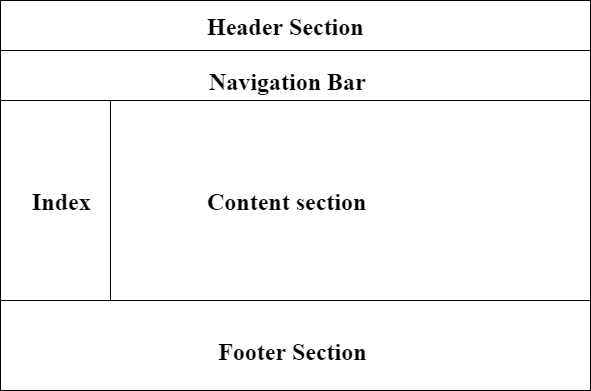
HTML is a markup language that you can use to create the structure and appearance of Web pages. A head is the first section of HTML, and it includes the document’s title and other basic information. A layout is the arrangement of elements on a page, and it includes everything from navigation menus to paragraph spacing.
Formatting Your HTML
When formatting your HTML, it is important to keep in mind the following points:
– Use a 12-point font for headings and main text.
– Use for bolding and for italics.
– Create divisions between paragraphs with a tag.
– Indent all code by four spaces.
Adding Images to Your HTML
Images can add great visual impact to your website or blog article, and can help make your content more interesting and engaging. There are a few different ways to add images to your HTML, and each has its own advantages and disadvantages.
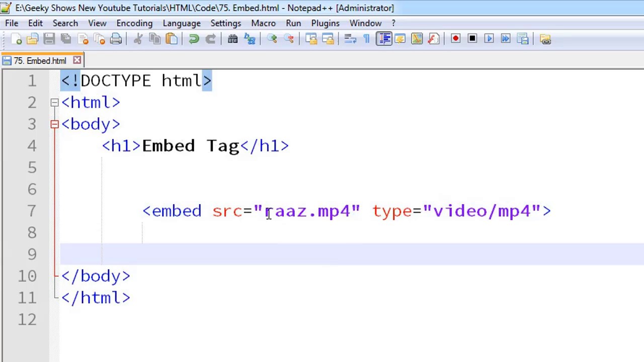
The first option is to use an image tag. This will automatically insert the image into the document, without any special formatting required. However, this approach has two main drawbacks: Firstly, it’s difficult to control how the image will look in relation to other elements on the page, and secondly, it can be difficult to ensure that all users of your website or blog article will be able to see the image properly.
The second option is to embed the image directly into your HTML code. This means that you’ll have full control over how the image looks and behaves, but it can also be more time-consuming to set up. Additionally, if you’re uploading multiple images then embedding them all individually could become tedious quickly.
The final option is to use an IMG tag. This will allow you to include an external image without having to embed it yourself – simply append it as a src attribute within the IMG tag. This approach has several advantages: Firstly, it’s easy for users of your website or blog article to access the images – no extra coding needed. Secondly, you can use CSS3 animations or transitions in order to create a more dynamic appearance for your images.
Testing Your HTML
If you’re like most web designers, you probably have a decent understanding of how HTML works. However, there are some general things that you should always verify when you create or revise an HTML page. Here are some tips for testing your HTML:
- Test for validity: Check to see that all the tags exist and that all the attributes are valid.
- Test for structure: Make sure the headings and paragraphs are nested correctly and that all the links work.
- Test for layout: See whether everything flows logically and looks consistent in different browsers.
- Test for accessibility: Verify that your page is accessible to people with disabilities, including screen readers and text browsers.
FAQs
1. What is the <head> section in HTML, and what is it used for?
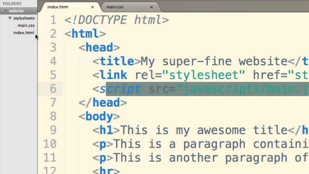
The <head> section of an HTML document is a crucial part that contains metadata, links to stylesheets, scripts, and other resources that are not directly displayed on the webpage. It provides essential information about the document, such as its title (displayed in the browser’s title bar or tab), character set, responsive design settings, and external files like CSS and JavaScript that affect the styling and functionality of the page.
2. How do I set the title of my web page in HTML?
To set the title of your web page, you use the <title> tag within the <head> section. The content you place between the opening <title> and closing </title> tags will appear in the browser’s title bar or tab. For example:
<head>
<title>My Awesome Web Page</title>
</head>
3. What is the purpose of the <meta> tag in the HTML head?
The <meta> tag in the HTML <head> section serves various purposes, such as specifying the character set, page description, keywords for search engines, and viewport settings for responsive design. Meta tags provide metadata about the HTML document, which can affect how the page is displayed or indexed by search engines but does not appear visibly on the page.
4. How can I link a stylesheet to my HTML document?
To link an external CSS stylesheet to your HTML document, use the <link> tag within the <head> section. You must specify the rel attribute as “stylesheet” and the href attribute as the path to your CSS file. For example:
<head>
<link rel=”stylesheet” href=”styles.css”>
</head>
5. What is the significance of the <body> tag in HTML?
The <body> tag encloses the content of an HTML document that is visible to the user. It includes text, images, links, forms, and other elements that make up the main part of the webpage. The <body> tag follows the <head> section and is where you place the content that users interact with.
6. How do I create a responsive layout using HTML?
To create a responsive layout, you’ll often start with the <meta> tag in the <head> section to set the viewport properties, like so:
<meta name=”viewport” content=”width=device-width, initial-scale=1.0″>
This ensures your layout adjusts to the screen size. Responsive design usually involves CSS more than HTML, using techniques like media queries, flexible grid layouts, and flexible images to adapt the layout to different device screens.
7. Can you explain the basic structure of an HTML document?
The basic structure of an HTML document includes a doctype declaration, <html> tag, <head> section, and <body> section. The doctype declaration defines the document type and HTML version. The <html> tag encompasses the entire document, the <head> section contains metadata and links to external resources, and the <body> section includes the content visible to users. Here’s a simple example:
<!DOCTYPE html>
<html>
<head>
<title>Page Title</title>
</head>
<body>
<h1>Hello, World!</h1>
</body>
</html>
This structure is the foundation upon which all web pages are built.