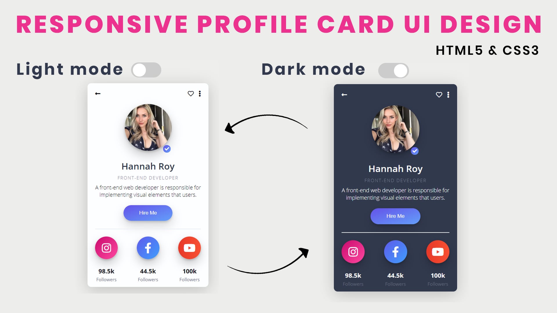
Responsive design is the future of web design. It’s a trend that has taken over in recent years, and for good reason. Not only does it make websites look great on any device, but it also keeps users engaged with your content no matter what their viewing environment. If you haven’t jumped on the responsive bandwagon yet, there are plenty of resources out there to help you to start with. In this blog post, we will show you how to use HTML to create responsive UI and give your website the edge it needs to succeed in today’s competitive market.
What is Responsive UI?
Responsive web design is a term that has been around since at least 2010, when Ethan Marcotte first wrote about it on the now defunct A List Apart blog. Responsive design is a way of designing for web and mobile devices that takes into account the different screen sizes andDPI (Dots Per Inch) resolutions available.
One of the main benefits to using responsive design is that it can help create a more consistent user experience across all devices. On desktop screens, for example, users may see a website with large text blocks and images that scale down as they move to smaller screens. Meanwhile, on mobile devices, users may see smaller text blocks and images that zoom in on their screen as they scroll down. This allows websites to be more compact and easy to navigate on all devices.
There are several different responsive design frameworks available, such as Foundation 5’s Responsive Design Module (RDM), 960UI’s Responsive Checklist, and Nicolas Gallagher’s ReactiveForms library. Each framework has its own set of features and limitations, so it’s important to choose one that will work best for the project being created.
Responsive web design is still evolving, so there are always new developments being made. It’s important to stay up-to-date with the latest trends and techniques so that your website looks its best on every device type out there!
How to create a Responsive UI?
Responsive web design means designing a website so that it looks good on any device, from a small phone to a larger desktop. There are many factors to consider when creating a responsive website, from the width of the columns in your content to the font size and spacing.
There are a few basic principles of responsive design that you should always keep in mind:
- Use media queries to adjust layout and CSS based on the device’s width.
- Use flexible images that can scale up or down without losing image quality.
- Use breakpoints to target specific devices with different layouts and styles.
- Test your website on various devices before launch to make sure it looks good everywhere!
Conclusion
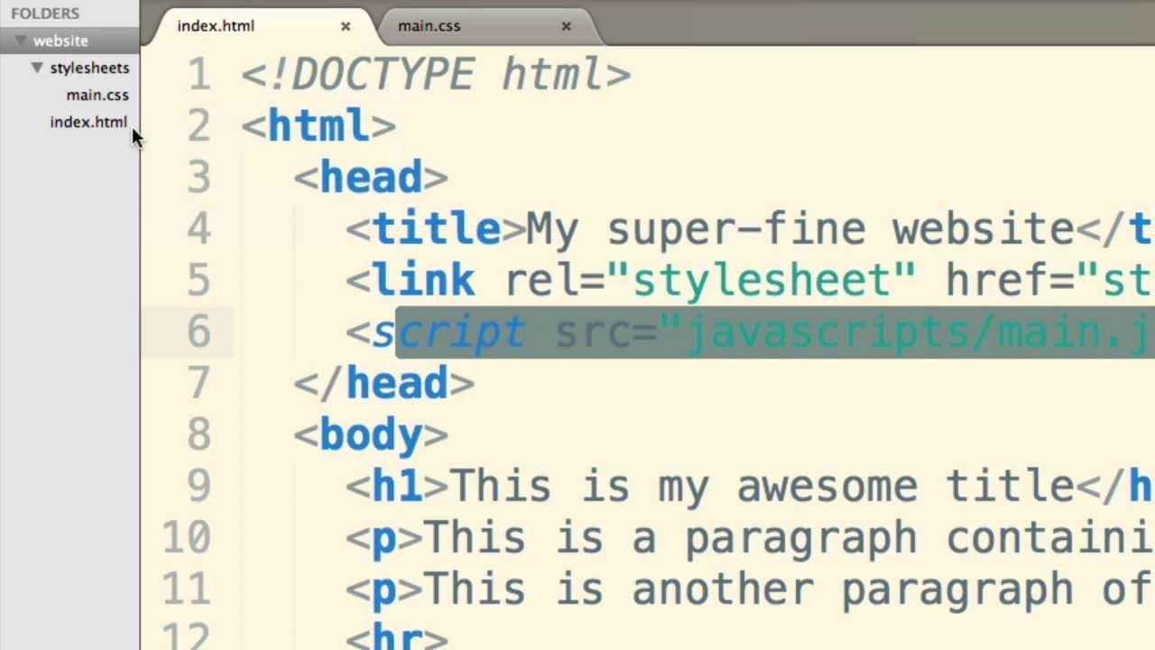
HTML is a versatile language that you can use it to create responsive user interfaces. This means that the layout and design of your website will automatically adjust to fit any device, no matter how large or small it is. This makes it an ideal choice for websites that need to be accessible from all over the world, without having to change any underlying code. Thanks for reading!

