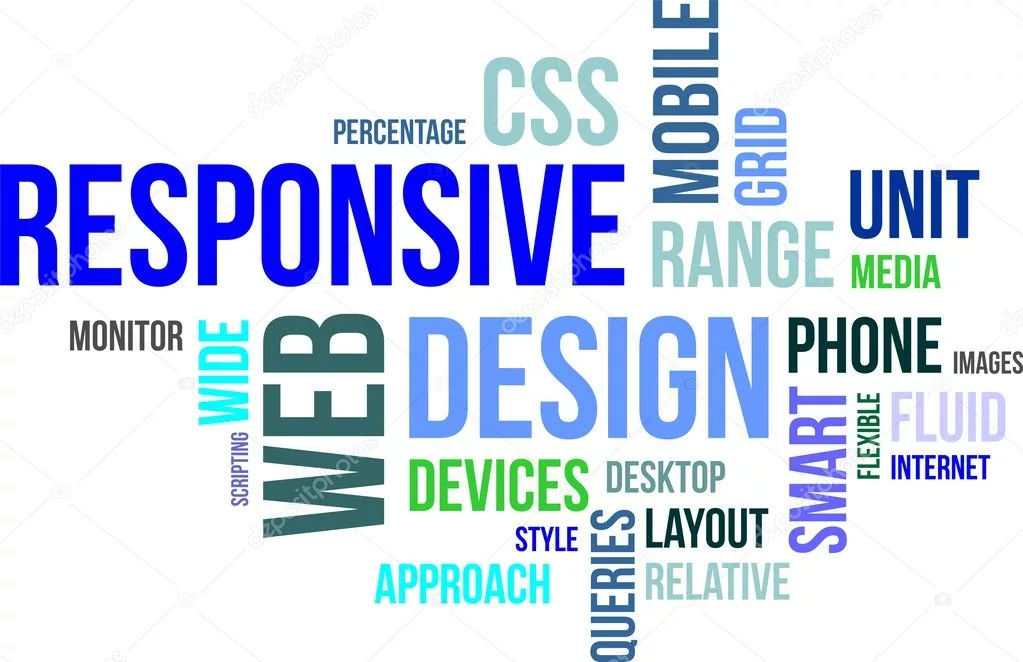
Are you tired of designing websites that look great on desktop but fall apart on mobile devices? Don’t worry, we’ve got the solution for you! With CSS3 media queries, you can create responsive designs that adapt seamlessly to different screen sizes. Whether your users are browsing on a tiny smartphone or a massive monitor, media queries allow you to deliver an optimal viewing experience every time. In this blog post, we’ll dive into the world of media queries and show you how to use them effectively in your CSS. Get ready to take your web design skills to the next level with responsive magic!
What are media queries?
What are media queries? In simple terms, media queries are a feature in CSS that allow you to apply different styles based on the characteristics of the device or screen size. They enable your website to adapt and respond intelligently to various devices, ensuring an optimal viewing experience for users.
With media queries, you can define different sets of CSS rules that will be applied when specific conditions are met. These conditions can include factors such as screen width, height, resolution, orientation (landscape or portrait), and even the user’s preferred color scheme.
Using media queries is like telling your website: “Hey, if the screen width is less than 600 pixels, change the font size and layout accordingly.” This flexibility allows designers to create responsive layouts that seamlessly adjust to different devices without sacrificing usability or aesthetics.
Media queries work by evaluating a set of conditions and applying corresponding styles if those conditions are true. For example, you can specify that certain styles should only be used when the viewport is larger than a specific width using min-width media query. On the other hand, max-width media query enables you to target smaller screens by specifying styles for viewports with a maximum width.
By combining multiple media queries with logical operators like ‘and’, ‘not’, and ‘only’, you have even more control over how your design responds across various devices. You can fine-tune your styling choices based on complex combinations of factors like screen size and device capabilities.
Media queries empower web designers to create responsive designs that adapt gracefully across different devices. By leveraging these powerful CSS features effectively in combination with other techniques like flexible grids and fluid images, you can ensure an outstanding user experience no matter what device your audience uses. So let’s dive into some practical examples next!
How to use media queries in your CSS
Media queries are a powerful tool in CSS that allow you to create responsive designs for your website. With media queries, you can target different devices and screen sizes, ensuring that your website looks great on any device.
To use media queries in your CSS, you start by specifying the @media rule followed by the desired condition inside parentheses. This condition usually includes properties like width or height along with an operator such as min-width or max-width.
For example, if you want to apply certain styles when the viewport is smaller than 768 pixels wide, you would write “@media (max-width: 768px) { … }”. Inside these curly braces, you can add specific CSS rules that will be applied only when this condition is met.
You can also combine multiple conditions using logical operators like “and” or “not”, allowing for even more control over how your styles are applied. For instance, “@media (min-width: 480px) and (max-width: 1024px) { … }” will apply the specified styles only when both conditions are true.
By using media queries effectively, you can create a seamless user experience across different devices and ensure that your website adapts beautifully no matter where it’s viewed from. So go ahead and experiment with media queries in your CSS to make your designs truly responsive!
Using media queries with width and height
Using media queries with width and height is an essential aspect of creating responsive designs. By specifying different styles based on the screen dimensions, we can ensure that our website looks great on any device.
When using media queries with width, we can target specific ranges to apply different styles. For example, we might want to change the layout when the screen width is less than 600 pixels. We can achieve this by writing a media query like this:
@media only screen and (max-width: 600px) {
/* styles for screens smaller than 600px */
}
Similarly, using media queries with min-width allows us to target larger screens and implement customized styles accordingly.
The same concept applies to height as well. Media queries with max-height or min-height can be used to adjust elements based on the available vertical space. This is particularly useful when dealing with content that needs more room vertically.
By combining these width and height-based media queries with other CSS properties such as font size or color, we have even more control over how our design adapts across devices.
Incorporating media queries into our CSS not only helps improve the user experience but also plays a significant role in search engine optimization (SEO). Responsive websites are often favored by search engines because they provide a better browsing experience for users on various devices.
To sum up, utilizing media queries in conjunction with width and height enables us to create flexible layouts that respond effectively to different screen sizes. With careful planning and implementation, web designers can deliver seamless experiences across all devices without compromising design aesthetics or functionality.
Using media queries with min-width and min-height
Using media queries with min-width and min-height is a powerful technique in creating responsive designs. By specifying the minimum width or height at which certain styles should apply, we can create layouts that adapt to different screen sizes.
For example, let’s say we have a navigation menu that looks great on larger screens but becomes too cramped on smaller devices. We can use a media query with min-width to target screens below a certain width and adjust the styling accordingly. This allows us to create a more user-friendly experience for mobile users.
Similarly, by using media queries with min-height, we can optimize our designs for different vertical space constraints. This is particularly useful when dealing with content-heavy pages where scrolling might be limited on smaller screens.
By combining both min-width and min-height in our media queries, we have even more control over how our designs respond to different device dimensions. This level of granularity ensures that our websites look good on a wide range of devices.
Utilizing media queries with both min-width and min-height is essential in building effective responsive designs. The ability to tailor styles based on specific screen size requirements allows us to provide an optimal user experience across various devices.
Combining media queries with other CSS properties
Combining media queries with other CSS properties allows you to create even more dynamic and responsive designs. By leveraging the power of media queries alongside other CSS properties, you can fine-tune the appearance of your website based on different screen sizes or device orientations.
One common use case is combining media queries with font-size adjustments. You may want to increase the font size for smaller screens to improve readability, while keeping it smaller for larger screens where there’s more space available. By using a combination of media queries and the `font-size` property, you can achieve this effect seamlessly.
Another example is combining media queries with background images. You might want to display a different background image depending on whether the user is viewing your site on a desktop or mobile device. With media queries and the `background-image` property, you have full control over which image gets displayed based on screen size.
In addition, you can combine media queries with positioning properties like `margin` or `padding`. This allows you to adjust spacing between elements differently depending on screen size. For instance, you could decrease margins between sections for mobile devices to save vertical space while maintaining wider margins for desktop screens.
Furthermore, by combining media queries with color-related CSS properties such as `color`, `background-color`, or even `border-color`, you can adapt your website’s color scheme across different devices. This ensures optimal visibility and aesthetics regardless of screen size or resolution.
The possibilities are endless when it comes to combining media queries with other CSS properties. The key is understanding how each property works individually and then experimenting with their combinations in order to achieve desired effects in your responsive designs. So go ahead, get creative, and make your website look great across all devices!
Summary
In today’s digital world, having a responsive website is essential. With the increasing number of devices and screen sizes, it’s crucial that your website can adapt and provide an optimal user experience across all platforms. This is where CSS3 media queries come in.
Media queries allow you to apply different styles to your web pages based on certain conditions such as screen width, height, or device orientation. By using media queries effectively in your CSS code, you can create flexible and dynamic designs that automatically adjust to fit any screen size.
To use media queries in your CSS code, simply define the desired conditions within @media rule blocks. You can specify various properties such as width, height, min-width, min-height, max-width, max-height along with other CSS properties like font-size or background-color.
Using media queries with width and height enables you to target specific screen dimensions and make adjustments accordingly. For example:
@media (max-width: 768px) {
/* Styles for screens smaller than 768 pixels wide */
}
@media (min-height: 600px) {
/* Styles for screens taller than 600 pixels */
}
Combining media queries allows for even more precise targeting of different devices or situations:
@media only screen and (min-device-width: 320px)
and (max-device-width: 480px)
and (-webkit-min-device-pixel-ratio : 2) {
/* Styles for high-density retina displays between
320-480 pixels wide */
}
By utilizing these powerful tools effectively in your design process, you can create visually stunning websites that are accessible on any device or platform without compromising the user experience.